

Yes, you can change your gutter colour without replacing the whole house: update the gutters independently, then coordinate the new shade with the roof, fascia and walls. Monument is the most popular colour for new modern roofs in Australia, followed by Shale Grey and Woodland Grey. Choosing gutter colours for your home works best when you compare all the exterior finishes together. A colour that looks right on a screen can appear different in natural light.
It’s understandable to hesitate: gutters sit at the edge of the roof, so a strong or pale shade can change how the whole exterior reads. You don’t need to make the choice in isolation. This guide shows how to change gutter colours, choose popular COLORBOND® shades, coordinate gutters with fascia, downpipes, roof and walls, and compare printed samples in different light. It also explains how surrounding greenery and neighbouring homes can inform the palette, helping you settle on a colour that feels balanced and deliberate rather than like an afterthought.
Key Takeaways
- Start with the largest exterior surfaces, then use them to guide a gutter shade that feels connected to the home.
- Decide whether gutters, fascia and downpipes should blend together or create a considered contrast with trims.
- Compare printed colour samples against your home in natural light before settling on a shade.
- Use nearby trees, garden tones and the surrounding streetscape to help refine your colour choice.
1. What is the most popular Colorbond gutter colour in Australia?
Monument is the most popular colour for new modern roofs in Australia, followed by Shale Grey and Woodland Grey. Grey Colorbond colours have been the most-specified colour family in Australian new builds since 2020. For gutters or gutter guards, use the roof as a starting point, then compare the shade with your walls and other exterior finishes.
Australian homeowners can choose from the COLORBOND® steel core range of 22 colours, with six extra colours in the premium Matt finish range. Popular options include Monument for a strong dark outline, Shale Grey for a softer neutral, and Woodland Grey for a deeper, earthy tone. The available selection depends on the product range offered by the supplier, so compare colours for the specific gutters or guard you’re considering.
Match contrast to the wall material. Monument can echo a dark roof or window trim against pale render, while a lighter grey can sit quietly beside white or cream walls. On red or brown brick, a darker neutral can pick up the roof without competing with the brick’s varied tones. For cladding, compare the gutter with the dominant panel colour, not just one accent board.
Council and heritage controls can depend on the property and its location. If your home has an approved exterior palette, use it to guide the gutter shade. Otherwise, coordinate the colour with the existing roof, walls and trim.
Popular combinations include Monument gutters with light render, Shale Grey with white or pale-grey walls, and Woodland Grey beside earthy brick or green landscaping. Grey roofs can pair with darker guards, while white exteriors often work well with light or neutral guards. Choose one main relationship, such as matching the roof or fascia, then check the overall balance against the wall colour. This keeps gutters and guards visually connected without requiring every exterior surface to match.
2. Gutter, Fascia and Downpipe – Should They All Match?
The gutters and fascia don’t have to match exactly, but a clear colour relationship makes the roofline feel intentional. Start with both, then coordinate the fascia with the roof or wall trim. For example, Monument gutters can continue a dark roofline, while a lighter fascia creates a defined edge against pale walls.
Compare COLORBOND® gutter colours with the roof and trim together, rather than selecting a shade based on one feature alone. Check whether the roof has warm or cool undertones, then compare it with the fascia, window frames and door trim. A Shale Grey roof, for instance, may sit comfortably with similar neutral trim; a dark roof can connect with darker gutters or window frames.
Downpipes can match the gutters to create a continuous outline, or blend with the wall behind them. On a light-rendered wall, a matching pale downpipe is less prominent. Against dark cladding, matching the gutter colour can make the downpipe feel like part of the same frame.
For gutter guards, matching the existing gutters usually gives the roof edge a more cohesive appearance. If the gutters are COLORBOND®, compare the guard with their actual shade, not just the roof colour. House plans may identify the original gutter and roofing colours, which can help when the gutters remain in place.
A roof that has aged may have faded from its original colour. If you’re matching replacement gutters to roof tiles, compare the gutter sample with a cleaned tile rather than the roof’s average weathered tone. This helps avoid choosing a shade based on dirt or uneven fading.
Where gutters, fascia or downpipes need a coordinated update, guttering and fascia work can bring those exterior elements together. Consider the roof, wall and window trim as one palette before settling on the final combination.
3. Viewing printed colour samples in different light
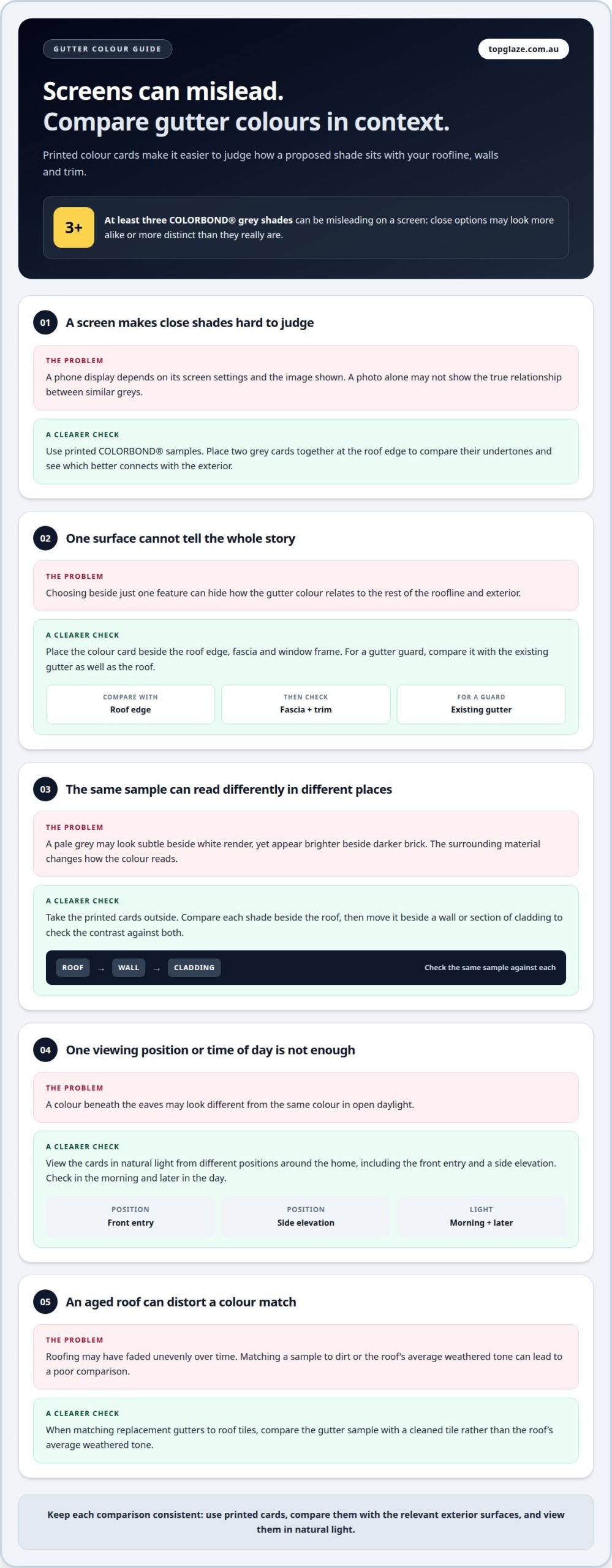
A colour card gives a more dependable comparison than a phone screen. Screens can mislead on at least three Colorbond grey shades, so a digital image may make close options look more distinct or more alike than they are. Use printed samples to judge the actual relationship between a proposed gutter colour and your home’s roofline, walls and trim.
Begin by placing colour cards beside the surfaces they need to coordinate with. Hold a Monument sample near the roof edge, fascia and window frame, then compare it with a lighter grey option. If you’re selecting a gutter guard, position the sample beside the existing gutter as well. This side-by-side check makes undertones and contrast easier to notice.
Take the samples outside and view them in natural light against the house. Compare each shade beside the roof, then move it against a wall or a section of cladding. A pale grey against white render may look subtle, while that same sample beside darker brick can appear brighter. The surrounding material changes how the colour reads.
Look at the cards from different positions around the home, including the front entry and a side elevation. A colour seen beneath the eaves may appear different from one viewed in open daylight. Check it in the morning and later in the day, then compare the options again before deciding. Keep the cards beside the same surface each time so the comparison stays consistent.
Don’t choose from a photograph alone. Printed COLORBOND® samples let you compare colour cards with your home’s existing finishes, while a phone display depends on its screen settings and the image shown. If two greys seem nearly identical on screen, place their printed samples together at the roof edge. That direct comparison can reveal which shade better connects the gutter to the rest of the exterior.
4. Considering the surrounding landscape and neighbouring properties
A gutter colour sits within a broader view, not against a blank backdrop. In a leafy Melbourne street, nearby trees and garden beds can make earthy greens or browns feel connected to the landscape. On a more open street with pale rendered homes, a muted neutral may relate more naturally to the surrounding buildings. Use these surroundings as context, while keeping your own roof and walls as the main reference points.
Start by looking at the house from the street, where gutters form part of the roofline. Note the colours that repeat nearby, such as dark roof edges, pale walls or timber-toned fences. Then compare your preferred gutter samples with those features. A green that echoes garden foliage can soften a home’s outline, while a brown may pick up brick or established trees. Choose a shade that relates to the setting without making the gutters disappear unintentionally.
Neighbouring homes can help you judge the character of a street, but they don’t need to dictate your palette. A Monument roof nearby may show how a dark edge looks against local greenery; your own pale cladding may call for a different balance. Compare the gutter colour with your house first, then step back and consider whether it sits comfortably among nearby homes. This keeps the result personal and visually settled.
Check the view from more than one approach. Look from the front gate, across the street and along the side boundary, where a downpipe may stand out against a fence or garden. If shrubs grow close to the wall, consider how their foliage frames the gutter line. Revisit the choice as garden colours change through the seasons, rather than judging it only beside one flowering plant.
Use the surrounding landscape to refine your shortlist, not replace comparisons with the house itself. If you’re planning connected updates to the roof edge, discuss your gutter colour plans as part of the project.
Top Glaze Roofing Systems: Roof Restoration
Top Glaze Roofing Systems provides Roof Restoration for homeowners reviewing their roof’s appearance and gutter colour together. If the roof needs broader work, the company also provides Roof Replacement and Roof Repairs, while Guttering & Fascia addresses the roofline elements that frame your chosen palette.
Consider this next step when worn roofing or ageing gutters make colour decisions part of a wider exterior update. Coordinating the roof and gutterline can help you plan a consistent finish, rather than selecting a gutter shade without considering the surrounding work. The right service depends on what your roof and guttering need.
Contact Top Glaze Roofing Systems to discuss your roof restoration or guttering needs.
Make your colour choice part of the roof plan
Before settling on a shade, write down the colour name and finish you’ve chosen, along with the roof and exterior details it needs to complement. Keep the sample or a clear note with your renovation plans. This gives you a practical reference if guttering work becomes part of a broader roofing project, rather than leaving the final choice to memory.
Choosing gutter colours for your home is also a useful prompt to consider the roof’s overall condition. Top Glaze Roofing Systems can help with Roof Restoration, Roof Replacement and Roof Repairs, depending on the work your roof requires. Thinking about the roof and its edge as one project can make the colour decision easier to carry through.
For a considered next step, contact Top Glaze Roofing Systems to discuss your roofing needs. With a clear colour preference and a practical plan, you can move ahead with confidence and create an exterior that feels considered and cohesive.
Frequently Asked Questions
Can I change my gutter colour without replacing the whole house?
Yes, you can replace or update the gutters without changing the rest of the home. Choose a shade that works with the roof and exterior finishes that will remain. If the roof and walls are staying, use them as fixed reference points and select gutters to complement them. This lets you refresh the roofline as a separate exterior improvement.
Do dark Colorbond gutters get hotter?
Dark surfaces generally absorb more sunlight than lighter ones, so dark gutters can become hotter in direct sun. The temperature also depends on how much sun reaches the roof edge and how freely air moves around it. If heat is a concern, compare a lighter sample with your preferred dark shade, while keeping the roof and fascia colours in view.
Gutter, Fascia and Downpipe: should they all match?
No, matching all three is a choice, not a requirement. A consistent colour can make the roofline look continuous, while a downpipe that blends with the wall can be less noticeable. For example, gutters and fascia could share a shade, with the downpipe coordinated to the wall. Consider the view from the street and the side of the house before settling on the arrangement.
What is the most popular Colorbond gutter colour in Australia?
For gutters, consider how the shade relates to your existing roof and exterior rather than choosing by popularity alone. A colour card held beside the roof edge can help show whether a dark or lighter grey suits the home’s overall palette.
How do I choose gutter colours to match an Australian home’s roof, fascia and exterior?
Choosing gutter colours for your home starts with the exterior feature that will remain unchanged. If the roof is staying, compare its undertone with gutter samples beside the fascia and wall. For example, a neutral roof with dark window frames might suit gutters that echo the frames. Assess the samples at the property to judge how the full palette works together.
Which gutter colours best suit brick, weatherboard and rendered homes?
Choosing gutter colours for your home means considering how the shade works with each material. Brick homes can suit a gutter colour related to the roof or a tone in the brick. On weatherboard, compare the gutters with the boards and window trim. Rendered homes can use a close-matching neutral or a darker roofline accent. Judge the combination across the whole exterior.


